Email icon
Back

HIVED The future of parcel delivery

Visual identity · Web · Print · Product design · 2021-2023
HIVED is a London parcel delivery startup building a sustainable delivery network at scale, running an entirely electric fleet. I was head of creative, responsible for the output across everything the company put out, with one copywriter in my team.
A photo of an electric Renault Zoe wrapped in the HIVED brand, parked on the street.

Vision before identity

The identity couldn't start until the vision was something you could design against. I worked directly with the founders to understand what they were after and turned it into something concrete enough to build a system from. What came out wasn't a brief to stand out from other delivery companies. HIVED was changing how delivery itself worked, all-electric and paying drivers properly, and that needed to be noticed by people who weren't looking for it, which is a higher bar than beating the competition

Nothing like logistics

Logistics branding tends to reassure. The colours vary, but the posture doesn't: dependable, efficient, unremarkable by design, because the promise is that nothing goes wrong. We went the other way.
The logo's diagonal cut breaks the expected, and the system builds out from there with playful illustrations, energetic layouts, and elements drawn from parcels themselves: the anticipation, the unboxing, the moment it arrives. The balance to hold was between the efficiency of a logistics operation and the culture of the company running it. Logistics that doesn't look or feel like logistics.
The HIVED logotype in white on a darker background.
A little abstract illustration of a London map, including the Themes and all larger districts.
A preview of HIVED's hand drawn icons.
A preview of HIVED's brand book, showing colours and fonts.

From screen to van

Delivery lives in the physical world as much as the digital one, and that's what made the system hard rather than the look of it. One identity had to carry social, the website, marketing and sales on one side, and shipping labels, signage, merch, workwear and vehicle wraps for cars, bikes and vans on the other. A system that survives on a screen and falls apart on the side of a van isn't finished.
The fleet is where it pays off. Honeycomb Yellow with bold dark markings, holding together across every vehicle model and size we ran, so it reads the same from a distance whether it's a bike or a van.
Photo of a HIVED vehicle drivin in central London traffic, standing out in the crowd.
Picture of two blokes in HIVED hoodies getting their picture taken.
A HIVED van parking on the street, seen from above.

The tracking app

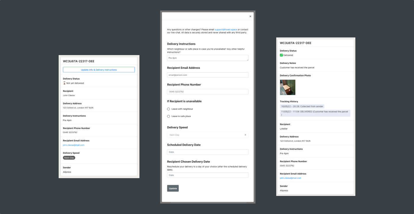
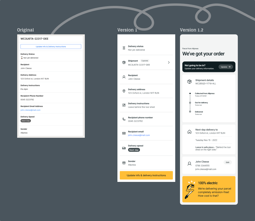
The brand said one thing and the tracking app said another, which for a company whose product is the delivery itself is a real problem rather than a cosmetic one. A single "change delivery" action was carrying too many scenarios and fell apart on edge cases like several parcels going to one address, and delivery information had no hierarchy, so everything looked equally important. Support absorbed the cost of it, and their tickets were most of the evidence, alongside an audit of the app, a competitive review, and testing with early users.
The main move was structural. We introduced shipments as a layer above individual parcels, so several parcels to one address became one thing with parts. Once that existed the rest got simpler: actions could be separated instead of stacked into one, information could be grouped and progressively disclosed, and delivery status could say what it meant. Three weeks, and an active service we couldn't disrupt, so we went for a minimum viable experience rather than a polished one.
The old system only knew about parcels, so it had no way to describe a delivery of several. Once it did, most of the confusion resolved itself. A lot of interface complexity turns out to be a missing concept rather than a layout problem.

Where it was heading

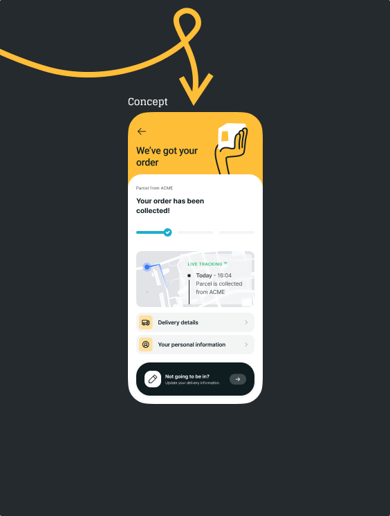
Alongside the MVP I worked up concept screens showing where the experience could end up once the patterns were settled. They weren't built, and weren't meant to be yet. Shipping something deliberately minimal is a much easier argument to make when people can see what it's making room for.
Person holding a laptop and browsing HIVED's website.
Image of delivery app interfaces
Person holding a laptop and browsing HIVED's website.
Special thanks to Rebecca Sundqvist, Megan McDonnell, and Ludvig Gårdh.